by
Cleo's Delights
Overview
Cleo's Delights was created during my UX bootcamp as my first deep dive into web design. The project was inspired by a childhood dream of opening my own bakery.
Role
UX Researcher, UX Strategist, Lead UI/UX Designer, UX Tester
Young Cleo had an “everything from scratch” era. The hours she spent in the kitchen were filled with the sound of a hand mixer, the smell of baked goods, and dreams of what her baker and café owner era would look like. Spoiler alert: Young Cleo never made it to that era.
Duration
4 Weeks
Tools
Google Suites, Zoom, DeepAI, Figma

Understanding the Space
To design an intuitive and engaging bakery e-commerce experience, I needed to first understand the mindset of pastry lovers. What motivates them to shop online? What holds them back?
I started by stepping into the shoes of a potential customer. I explored four popular local bakeries (Pawa Bakery, Tiong Bahru Bakery, Keong Saik Bakery, and Ollella) to evaluate what worked, what didn’t, and which features made online shopping smoother. This helped me form early hypotheses about the key pages and features customers expect in a bakery e-commerce site.
Ollella | Keong Saik | Pawa | Tiong Bahru | |
|---|---|---|---|---|
About Us / Backstory | Yes | Yes | Yes | |
Newsletter | Yes | Yes | Yes | |
Seasonal / Popular Feature | Yes | Yes | Yes | |
Product Filter | Yes | |||
Shipping / Delivery | Yes | Yes | Yes | |
Free Delivery | Yes | Yes | ||
Storage Method | Yes | Yes | Yes | Yes |
2
3
1
4
5
-
Ollella’s brand story isn’t visible in the main menu.
-
Seasonal menus: Ollella (dedicated page), Tiong Bahru Bakery (overlay).
-
Product sorting varies: Keong Saik uses filters, others organize by type.
-
Pawa Bakery hides delivery costs until checkout.
-
Storage info: Pawa/Tiong Bahru provide item-specific details, others use general instructions.
Competitor Analysis
Why do customers hesitate to shop for pastries online?
Through my conversations, I uncovered three recurring themes that pointed to gaps within the online bakery shopping experience.
-
50% of users prefer shopping in person because it allows them to see and smell the products before purchasing, enhancing their confidence in freshness and quality. The lack of sensory experience may lead to hesitation in purchasing online and a reliance on physical stores.
-
60% of users expressed that proper storage information is crucial to their shopping decision. They often struggle to find this information when purchasing online, which leads them to prefer buying in-store, where they can ask staff for guidance.
-
70% of users often return to trusted sources. They are confident that the ingredients used in the products are aligned with their dietary preferences and needs, making repeat purchase a smoother and faster process.
Defining the Problem
Many of the customers I spoke to just wanted to order a few nostalgic bakes for their families, without stress, second-guessing, or calling ahead. But time and time again, they ran into the same roadblocks: missing ingredient information, vague product names, and websites that looked too good to be true. Even the bakeries I reviewed in my competitive analysis lacked transparency around allergens and authenticity, making it hard for customers to shop online with confidence.
The Challenge
Customers are hesitant to make online purchases because of missing or unclear ingredient information. For those with allergies or dietary restrictions, the fear of accidentally consuming something harmful often outweighs the convenience of online shopping. This leads them to seek safer, offline alternatives. How might we provide a transparent product description to create a worry-free shopping experience for these customers?
Designing the Experience
Before jumping into UI, I mapped out how customers might navigate the site to create a smoother shopping journey.

User flow with Architect Information
To reflect how users think, I organized products by type, simplifying browsing and removing the need for a ‘sort by’ filter.
With the flow in place, I began translating strategy into design, crafting an interface that feels clear, inviting, and grounded in local food culture. A subtle green palette draws inspiration from pandan and banana leaves, commonly used ingredients in traditional desserts, creating warmth and familiarity while the clean typography ensures product details remain easy to scan.
Bringing the Solution to Life
With the visual direction and structure in place, I began refining key pages to address user needs at every stage of their journey.
The product listing and product page became a central focus. These screens are where trust is built. Users need clarity around allergens, ingredients, and product quality to feel confident following through with a purchase. My goal wasn’t just to make the products look appealing, but to provide the transparency and reassurance cautious customers are seeking.

Product Listing- All Products
1
2
3
-
Sorting items through product familiarity helps users browse intuitively and reduces decision fatigue.
-
High-quality images and straightforward names spark recognition and nostalgia, especially for users reconnecting with Singapore’s flavors.
-
Tailored allergen icons give cautious users confidence as they scroll and scan products.

Ondeh Ondeh Castella Cake - Description
2
3
1
-
Breadcrumb trail keeps users oriented while exploring multiple products from different categories.
-
Contextual drop downs for size and candle option only appear when relevant, keeping the experience clean and focused.
-
Key ingredients and clear storage instructions are presented together for quick, worry-free decisions
1
-
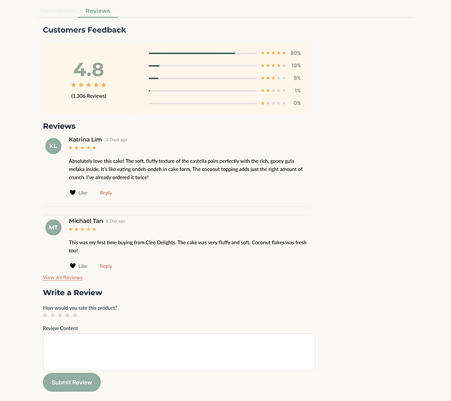
Reviews allow users to learn from others’ experiences and feel reassured before purchasing.
Ondeh Ondeh Castella Cake - Reviews
Iterate, Iterate
To uncover friction points and refine the experience, I tested the first prototype with five users aged 21–35. By observing how they navigated tasks, I surfaced key usability issues and gathered fresh perspectives on how to make the purchasing journey smoother and more intuitive. Their feedback directly shaped the next round of design iterations.

Kueh Kosui Product Page (Intial)
Users assumed the add to bag button doesn’t work and did not see that the number of products starts at 0 by default. To solve this issue, I made the default as 1. This allows users to quickly add a product to their cart.

Kueh Kosui Product Page (After)

Contact Us (Initial)
Users expressed missing business hours and directions as a pain point. I added clear store details and a map to make visiting or pickups easier.

Contact Us (After)
Final Thoughts
Designing Cleo’s Delights was my first deep dive into website design, and it taught me the importance of slowing down and grounding decisions in user needs before jumping into visuals. Early on, I let excitement take over. I skipped from rough sketches straight into high-fidelity screens, designing multiple pages and components without fully testing how they would work together.
For example, I added a review feature as part of each product page but overlooked how users would leave feedback or track past orders. In hindsight, a review system would require member profiles to prompt reviews post-purchase and support account functionality. If I had tested earlier and iterated more deliberately, I could have caught this sooner and designed a more seamless flow.
Next Steps
While this prototype has gone through several iterations, it is not a fully finished product. There are still areas that I could continue to iterate, including:
-
Expanding into mobile accessibility and responsiveness so that users can shop on the go,
-
adding more to the reviews section, allowing users to not just comment, but also add photos of the received product,
-
and strengthening the community through a monthly newsletter.