by
HeyJuni
HeyJuni is an online peer support platform that aims to break the stigma around mental health, creating a world where mental healthcare is not only effective but also accessible, affordable, and grounded in real human connection.
It was founded by Dr. Nhung Nguyen, a Vietnamese entrepreneur based in Singapore, who built the platform on the lived experiences of its founding members. Each of them has navigated their own mental health challenges, transforming their struggles into a shared drive to make a difference. Initially, HeyJuni focused on women in Vietnam and Singapore, reflecting Dr. Nhung’s mission to start locally while building a platform with global impact.
Role
Lead UX Researcher, UX Strategist, UI/UX Designer
Duration
7 Weeks
Tools
Google Suites, Zoom, Figma, FigJam

The Challenge Brief
While HeyJuni aims to democratize mental healthcare, user behavior showed opportunities to better align the experience with user needs—conversion rates were lower than expected. At the start of the project, Dr. Nhung shared her hypothesis that the main pain point lay in the 1:1 peer counseling booking flow. We used this as a starting point while expanding our research to look at the entire user journey, making sure we could uncover all potential barriers to engagement.
Original Booking Flow


Is it the product, user journey, or something else entirely?
Our initial research plan was to interview 15 women within HeyJuni’s target audience. However, we quickly learned that the platform had no existing clients to recruit from. HeyJuni sourced participants externally, and we ultimately interviewed 7 Vietnamese women aged 18–35. Through our interviews, we learned that:
71% of users consistently highlighted the importance of pricing with many appreciating HeyJuni’s affordable price for 50 minute sessions.
40% of users interpreted the price as a limited-time or trial offer and were hesitant about whether the promotional rate applied only to their first session or remain consistent for future sessions.
86% of users expressed frustration when answering the question, “What’s causing your anxiety or worry, making you seek support?” Expressing that their worries are multifaceted and cannot be adequately captured by a single option.
71% of users felt that the site has a corporate feel. While they appreciated the straightforward content, many found the overall experience lacked emotional invitation.
Defining the Problem
Many young women seek mental health support to help navigate their emotional stress brought on by school, work, and relationships. While HeyJuni aims to normalize mental healthcare, their current content and site flow lacks emotional resonance and clarity, making it difficult for users to feel safe and confident enough to take the first step. This disconnect creates confusion, frustrations, and an overwhelming experience, which has led to an increase in drop offs and low platform engagement.
The Challenge
How Might We redesign the booking experience so that it is emotionally supportive and builds long lasting trust, while giving users the confidence to take their first step toward mental health support?
.png)


Original Landing, Service, and Peer Counselor Pages
HeyJuni 2.0
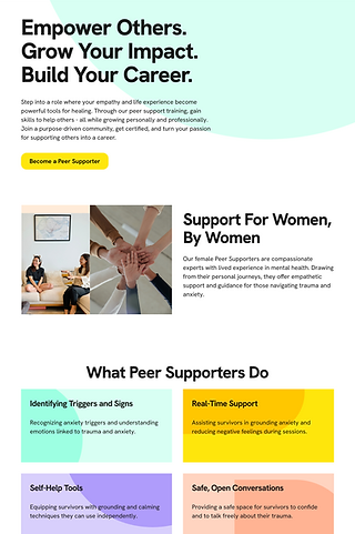
HeyJuni 2.0 is designed to be your trusted friend. With these updates, users can easily connect with peer counselors who truly understand them and join workshops and events that build a supportive, caring community. It’s a space where users can feel heard, supported, and empowered every step of the way.
We wanted HeyJuni 2.0 feel softer, more approachable, and less corporate. Hence, we introduced new typography sizes, added three new colors to the design system. with Milk as the primary background shade, and used fun, abstract shapes to create a youthful, energetic vibe. The three colors helped soften the vibrant colors, making the experience visually calmer while the smaller typography made the platform feel more welcoming and is easier on the eyes.
We also chose to go with a minimized header, moving additional links to the footer. This keeps the main navigation clean, focused, and reduces decision fatigue for the users.


Redesigned Landing, Service, and Peer Counselor Pages
New Experiences to Foster Better Connections
One of the most important goal for us was to create a digital space that was not only welcoming, but would also a place where individuals can form a connection. This was imperative to HeyJuni’s target audience. Not just with a platform, but with people who will be able to relate, console, and understand their feelings, even when it’s hard for them to process it in the moment. So when thinking about new directions for HeyJuni 2.0, we wanted to design experiences that felt more human, more personal, and more accessible.
Through our observations, we found that 71% of users wanted the experience to feel warm and inviting, while also getting to know the real people behind HeyJuni. The original site had a team page featuring executives and staff, but there was little visibility into the peer counselors themselves. In HeyJuni 2.0, users can now browse all available peer counselors and click into individual profile pages to learn more about their background, the topics they’re most comfortable discussing, and even book a 1:1 session directly. This not only adds transparency but also helps build trust, making it easier for users to take the first step toward seeking support.

New Feature: Gift Cards
In HeyJuni 2.0, we also introduced gift cards. This new feature allow users to purchase and send sessions to a friend or family of their choosing. This not only creates another introduction into HeyJuni, but also frames mental health care as something that can be shared, making support feel more accessible and less intimidating. Alongside this, we introduced individual, group, and corporate workshops and events, giving users a safe, shared space to learn, connect, and normalize mental health support.

New Feature: Workshops & Events
Refining the Experience
Through usability testing and ongoing reviews with Nhung, we discovered areas where HeyJuni 2.0 could be further refined. Each iteration brought us closer to a platform that feels intuitive, transparent, and supportive.
In Workshop Details V1, users could see when, where, and what an event was about. However, testing showed a key detail was missing: price. In Workshop Details V1, we revised the CTA from "Select Ticket" to "Register for Event", and included the price per ticket above the button, reducing uncertainty. Users also expressed frustration that their scroll was interrupted by being redirected to a new page for event registration. To minimize that disruption, we redesigned this step as an overlay that appears once the “Register for Event” button is clicked. This kept the flow smoother and less jarring.


Workshop Details V1 (Left), Workshop Details V2 + Registration Overlay (Right)
The best way to understand the redesign (and new features) is to try it out yourself.
Final Thoughts
Through HeyJuni, I learned how to balance stakeholder vision with user needs. From our first meeting, Dr. Nhung openly shared her frustrations, hopes, and vision for the platform. As designers, it was important to stay open-minded, guiding with empathy while remaining grounded in research.
This project also reminded me of the value of collaboration. It was invaluable to have someone to bounce ideas off. Having that partnership kept the momentum going even as we waited for more participants. While we hoped to speak with more participants, our smaller interview pool still surfaced consistent insights that shaped our direction. And through usability testings, we saw how even small changes, like clearer pricing or multiple booking flow entry, could have a big impact on the experience.
Future Iterations
Given the project timeline, we could only implement so many changes. But usability testing revealed opportunities for HeyJuni 2.0 to grow further, opening the door for potential future collaborations with Dr. Nhung:
-
User Profiles: Creating accounts would give users more control, allowing them to save events, bookmark articles, and track their journey over time.
-
Reflection Space: Many users voiced a desire for a dedicated space to process their journey. Somewhere to reflect after each session, note their highs and lows, and build a personal archive of their healing progress.
-
Peer Counselor Onboarding: Currently handled externally through a Google form, onboarding could be brought into HeyJuni itself, making the experience more seamless and trustworthy for counselors.